Case Study- JAPR
Project Overview
The Journal for African Policy Reviews (JAPR) is a digital platform dedicated to publishing policy research and academic literature across Africa. I was tasked with redesigning the existing website, which suffered from poor usability, visual clutter, and a confusing submission process. My goal was to transform the platform into a clean, intuitive, and trustworthy space for scholars to submit, browse, and engage with research content.
As the lead UI/UX designer, I reimagined the entire user experience—streamlining workflows, improving accessibility, and introducing a design system that reflects the professionalism and credibility of the journal.
Problem Statement
The original JAPR website presented several challenges:
Disorganized layout and inconsistent visual hierarchy.
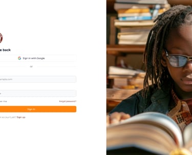
Complex submission forms with poor guidance and validation.
Lack of mobile responsiveness and accessibility features
A visual style that didn’t reflect the journal’s academic credibility.
These issues created friction for users—especially first-time contributors—and undermined the platform’s potential as a trusted hub for African policy research.


Ideation and Process
To guide the redesign, I conducted a comparative analysis of academic platforms such as JSTOR, SSRN, and African Journals Online. I also reviewed:
User feedback from scholars and contributors.
Common pain points in academic publishing workflows.
Accessibility standards for research platforms.
Visual trends in scholarly design (minimalism, typographic clarity, structured layouts).
Key insights:
Users prioritize clarity and structure over visual complexity.
Submission forms must be intuitive and error-tolerant.
Readability and trust indicators (e.g., citations, author bios) enhance credibility.
Mobile responsiveness is essential for accessibility.
Ideation and Process
I began with user journey mapping to understand how contributors and readers interact with the platform. From there:
Created wireframes for key flows: submission, browsing, reading, and account management
Developed a modular layout system to accommodate various content types (articles, reviews, references)
Iterated on design components based on usability heuristics and academic conventions.
I also explored typographic pairings and color palettes that would evoke professionalism while remaining visually approachable.
Design Execution and final Outcome.
Using Figma, I designed a clean, responsive interface with:
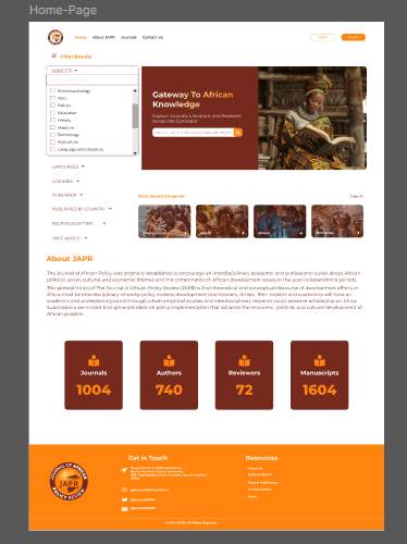
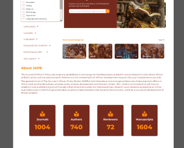
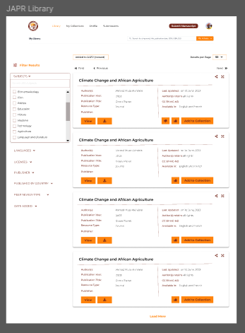
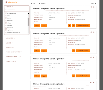
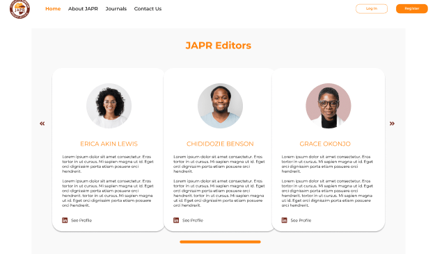
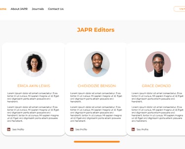
A structured homepage featuring featured articles and categories.
Simplified submission forms with clear guidance and validation.
Readable article layouts with citation support and author metadata.
A neutral color palette and serif/sans-serif typography for academic tone.
The final design was implemented in collaboration with developers and stakeholders, ensuring alignment with publishing standards and backend functionality.