Case Study - Msendo
Project Overview
Msendo is a mobile-first platform designed to simplify urban transportation and package delivery. The goal was to create a seamless experience for users requesting rides or sending packages, while establishing a strong brand identity that communicates speed, reliability, and ease of use.
I led the end-to-end design process—from brand development and UI/UX design to creating launch materials like flyers and a promotional video. This project allowed me to combine strategic thinking with visual storytelling to deliver a product that was both functional and engaging.
Problem Statement
Urban mobility and delivery services in the target region were fragmented, with users often relying on multiple apps or informal systems. Msendo aimed to unify these services into one intuitive platform, but needed a design that could build trust, reduce friction, and appeal to both tech-savvy and first-time users.
Research Insights
To inform the design, I reviewed:
Existing ride-sharing and delivery apps (e.g., Bolt, Uber, InDrive etc.)
User reviews and pain points from similar platforms
Behavioral patterns around mobile usage and service expectations in urban Nigeria
Visual trends in mobility branding and app interfaces.
Key insights:
Users value simplicity and speed over feature-heavy interfaces
Trust indicators (e.g., driver ratings, delivery tracking) are crucial
Visual clarity and intuitive navigation reduce drop-off rates.

Design Execution & Final Outcome
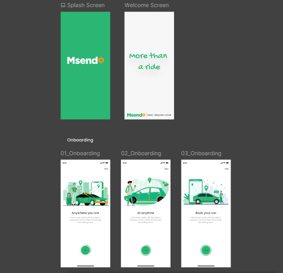
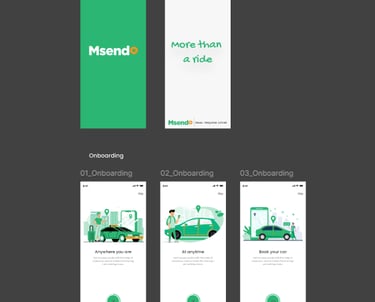
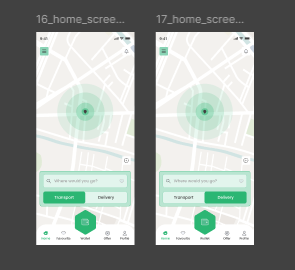
The visual identity for Msendo was intentionally minimal yet meaningful. I chose a clean, modern typeface and spelled out “Msendo” in green to evoke growth, movement, and trust. To reinforce the app’s core function—location-based ride and delivery services—I transformed the letter “O” into a bright orange location pin. This subtle design element became a signature mark across the app and marketing materials, tying the brand directly to its purpose.
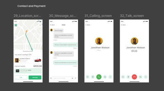
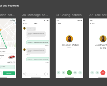
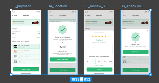
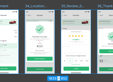
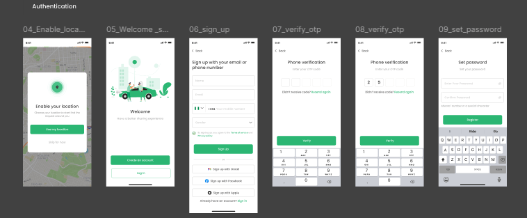
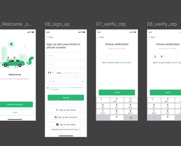
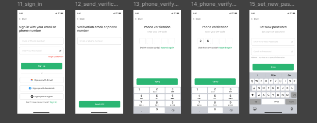
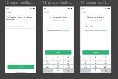
Using Figma, I designed a mobile-first interface with:
Clear CTAs and iconography for intuitive navigation
Responsive layouts optimized for various screen sizes
A cohesive design system that extended from the app to flyers and a launch video